The windshield as an intelligent interface
Modern HUD systems overload drivers with information — navigation, alerts, speed, notifications — all competing for attention at once. The problem isn't the data. It's the design. MR Alert Vision Pro rethinks the car windshield as a mixed reality display that surfaces only what matters, exactly when it matters.
This was a year-long individual research and design project at UVA — covering user research, system architecture, gesture interaction, sensor integration, and high-fidelity prototyping.
Cognitive overload
at 60 mph
Behind the wheel, drivers constantly juggle visual scanning, audio navigation, speed monitoring, and environmental hazards — all simultaneously. Current HUD designs make this worse, not better, by displaying every piece of information at the same visual priority.
Divided attention in complex environments heightens accident risk by impairing the driver's ability to prioritize what's actually critical in the moment.
Current HUD designs: every alert at equal priority, no context awareness
User segmentation — busy city drivers as primary, passengers as secondary
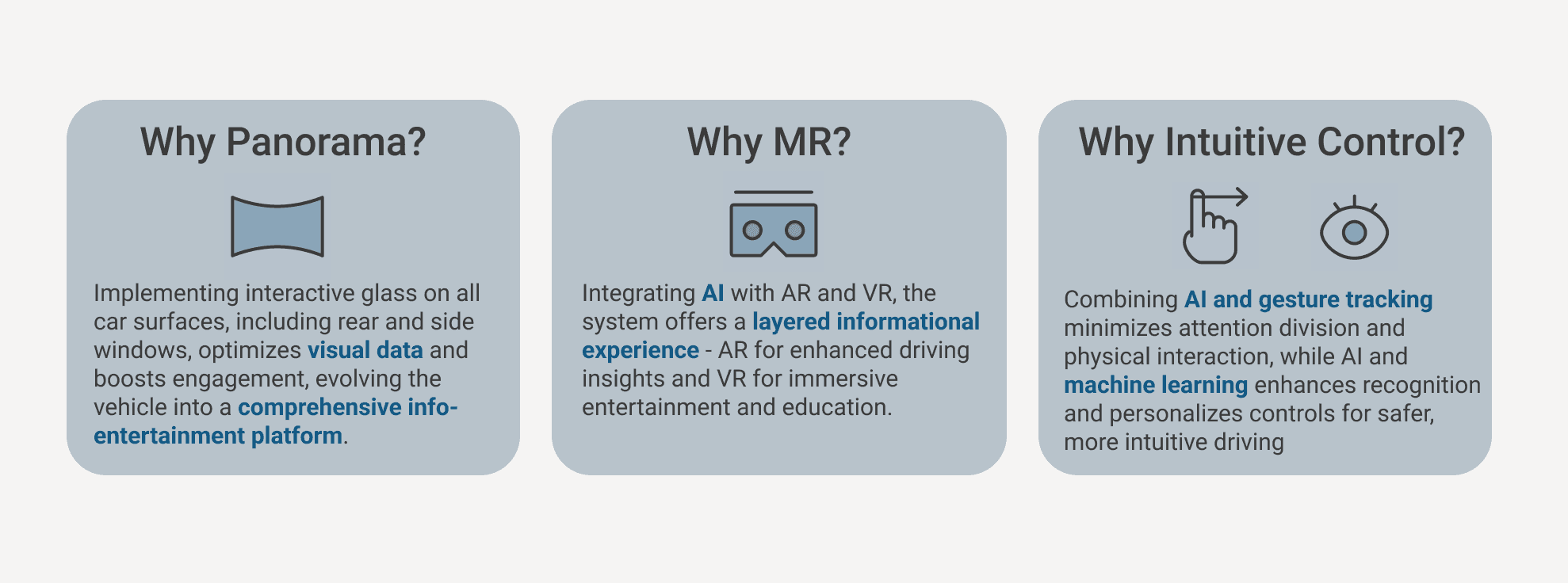
Design decision framework — Panorama view, MR integration, intuitive control
What drivers actually
need vs. what they get
An initial questionnaire explored drivers' current experiences and pain points with existing in-car information systems, focusing on how they process information while driving.
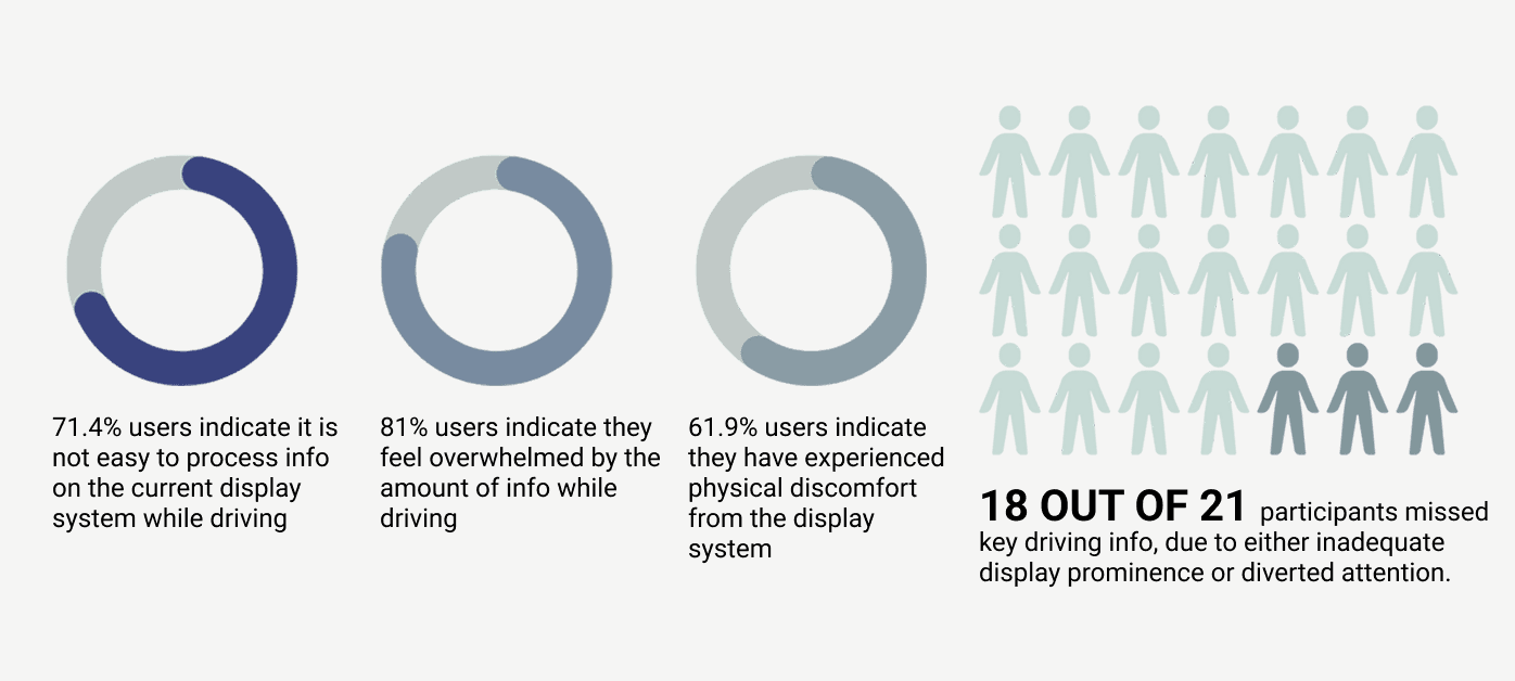
Questionnaire results — 21 drivers, varied experience levels
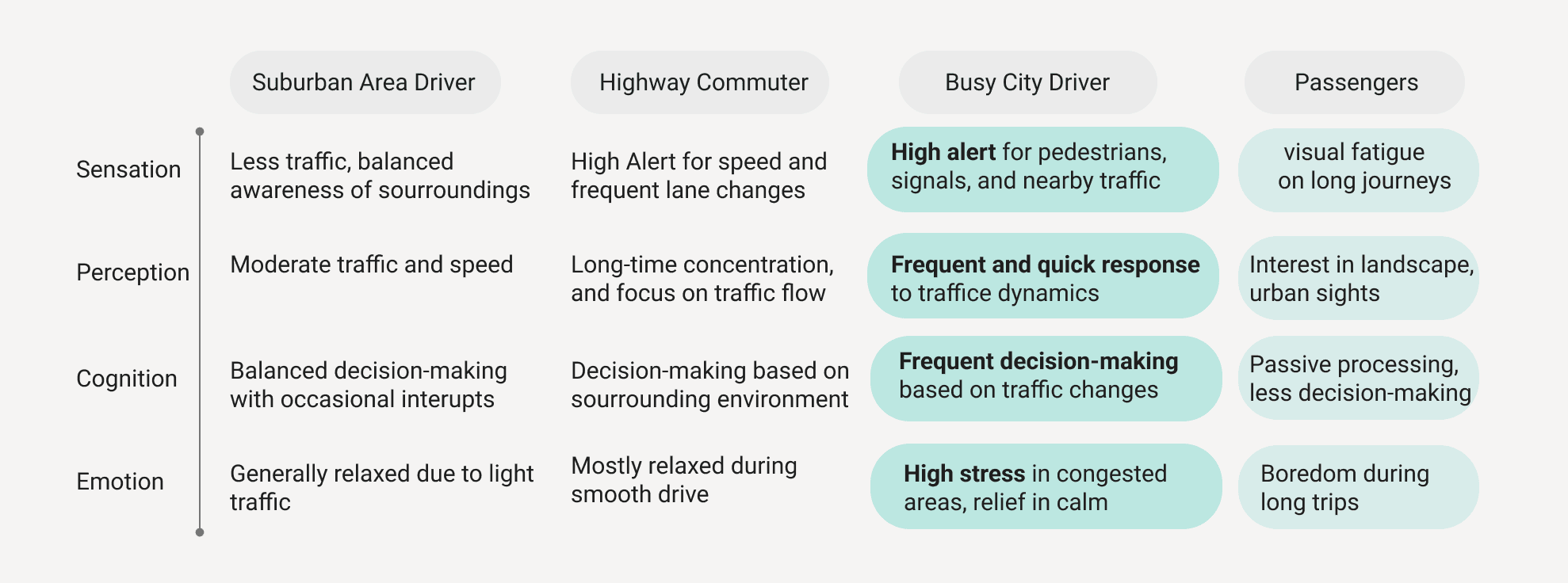
In-depth interviews with drivers across different experience levels and environments surfaced the nuanced realities of driving attention and information overload.
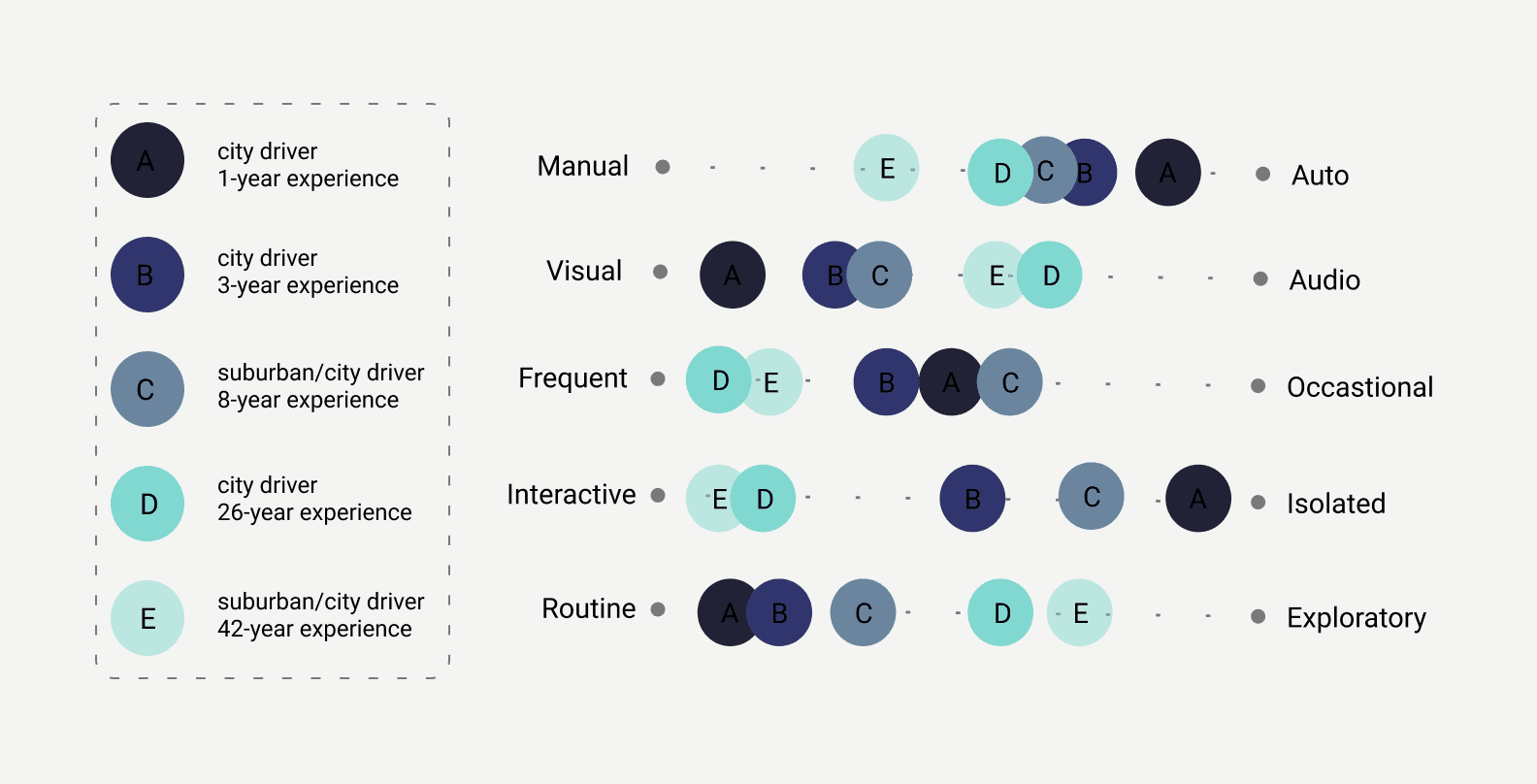
Expert interview synthesis
"Navigating in the urban jungle is hard due to unpredictable traffic, pedestrians, bikers, and the constant buzz of city life. Staying alert amid such chaos is crucial yet demanding."
Alex — 20 years old, college student in DC. 2-year driving experience, 30-minute daily commute. Represents the core case: a young urban driver overwhelmed by information during routine city driving.
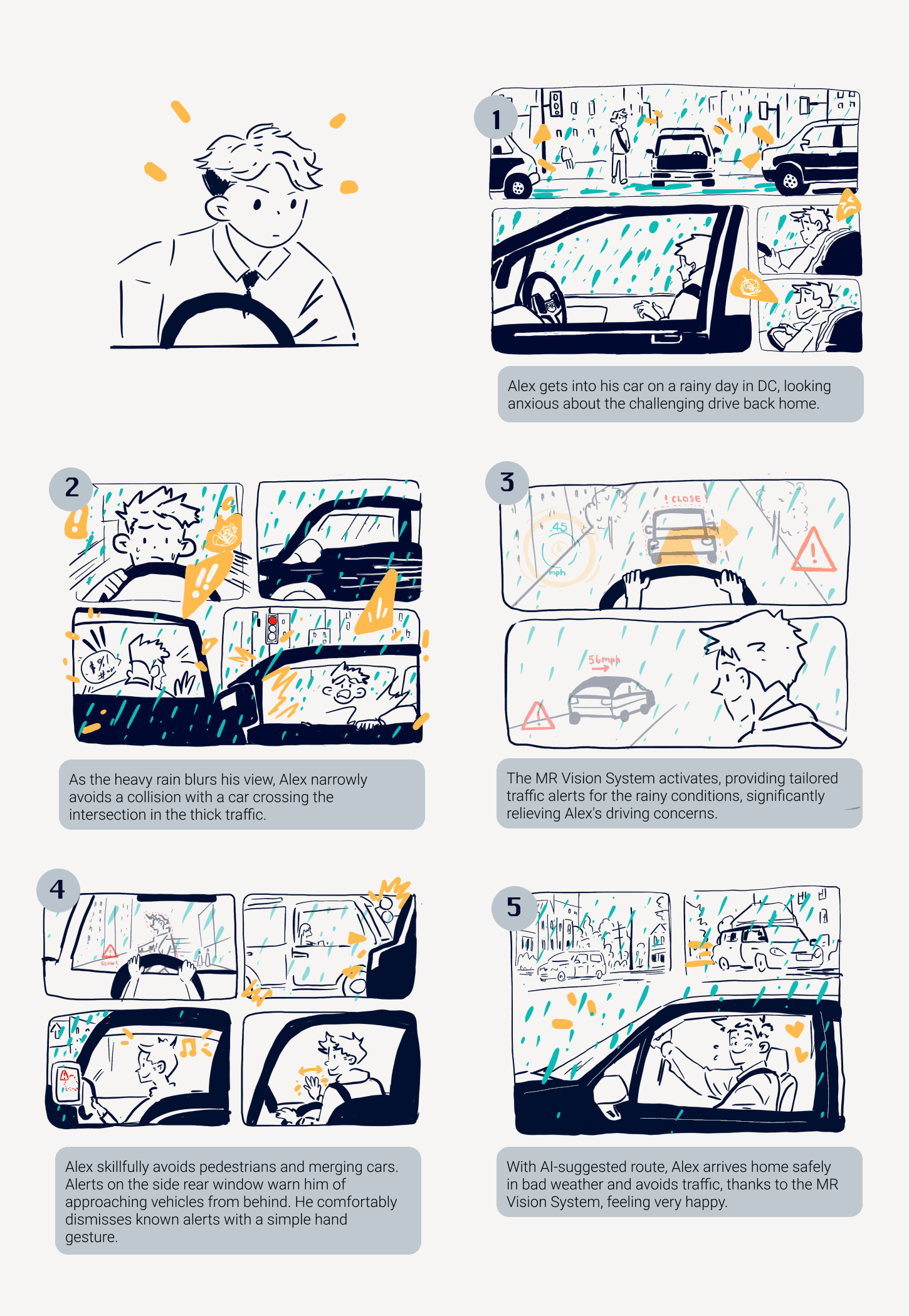
Alex's journey — storyboard mapping daily commute pain points
Designing the
intelligence layer
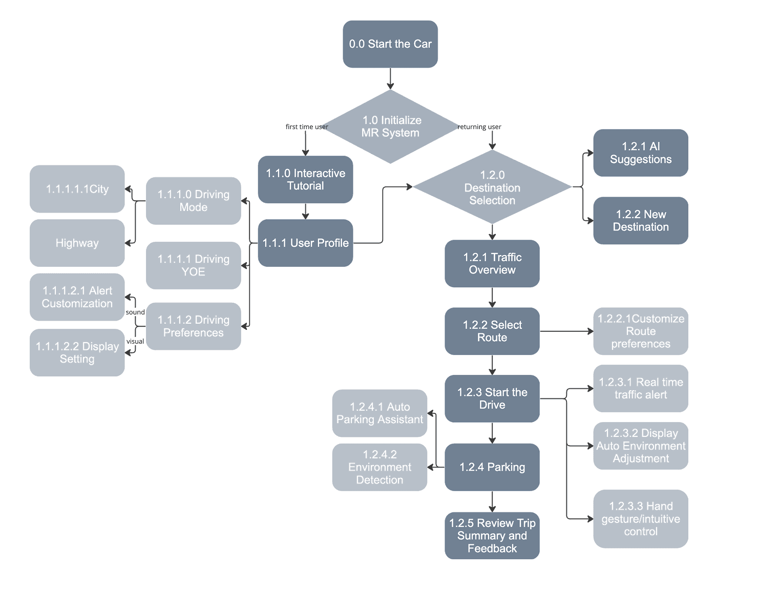
To enhance safety and user experience, I mapped the full system's information flows — what data enters (sensors, cameras, GPS, user gestures), how it's processed, and what gets surfaced on the display and when.
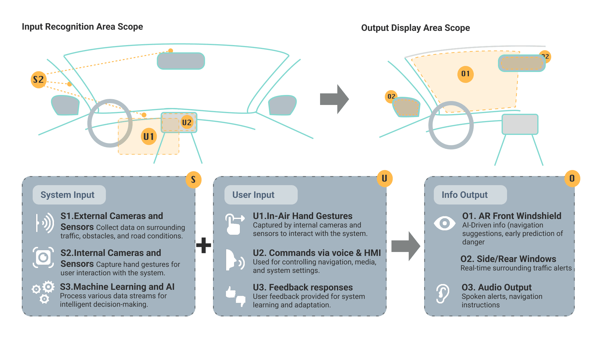
System input/output architecture — from sensor data to display decision
Five intuitive right-hand gestures designed for the most common commands — informed directly by user interviews asking drivers what gestures felt natural. Minimal visual glance required, zero manual input.
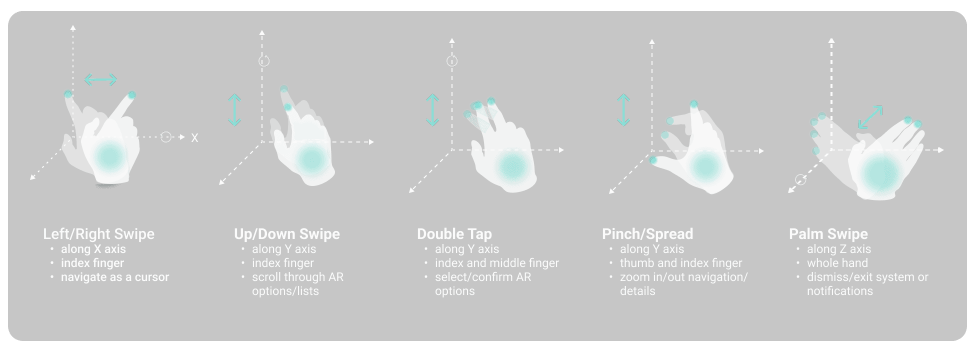
Five right-hand gestures — designed from driver intuition, not convention
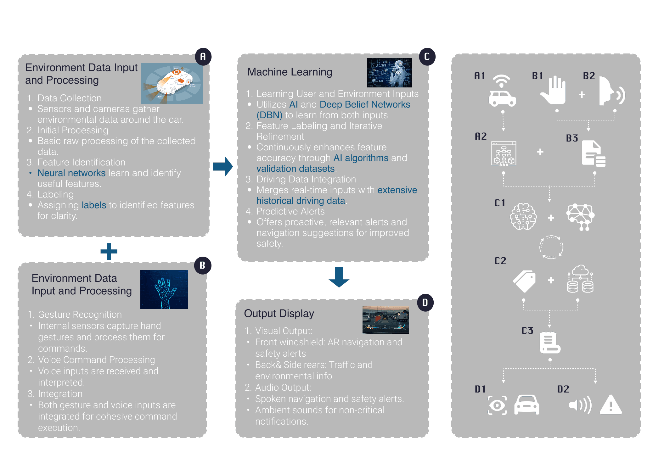
Full MR + AI system architecture — data processing and interaction pipeline
A thorough study of ultrasonic sensors and millimeter-wave radar determined the optimal sensor combination — balancing close-range precision with wide-field environmental awareness.
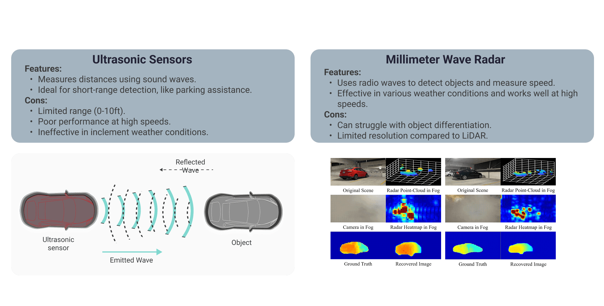
Sensor technology comparison — ultrasonic vs millimeter-wave radar
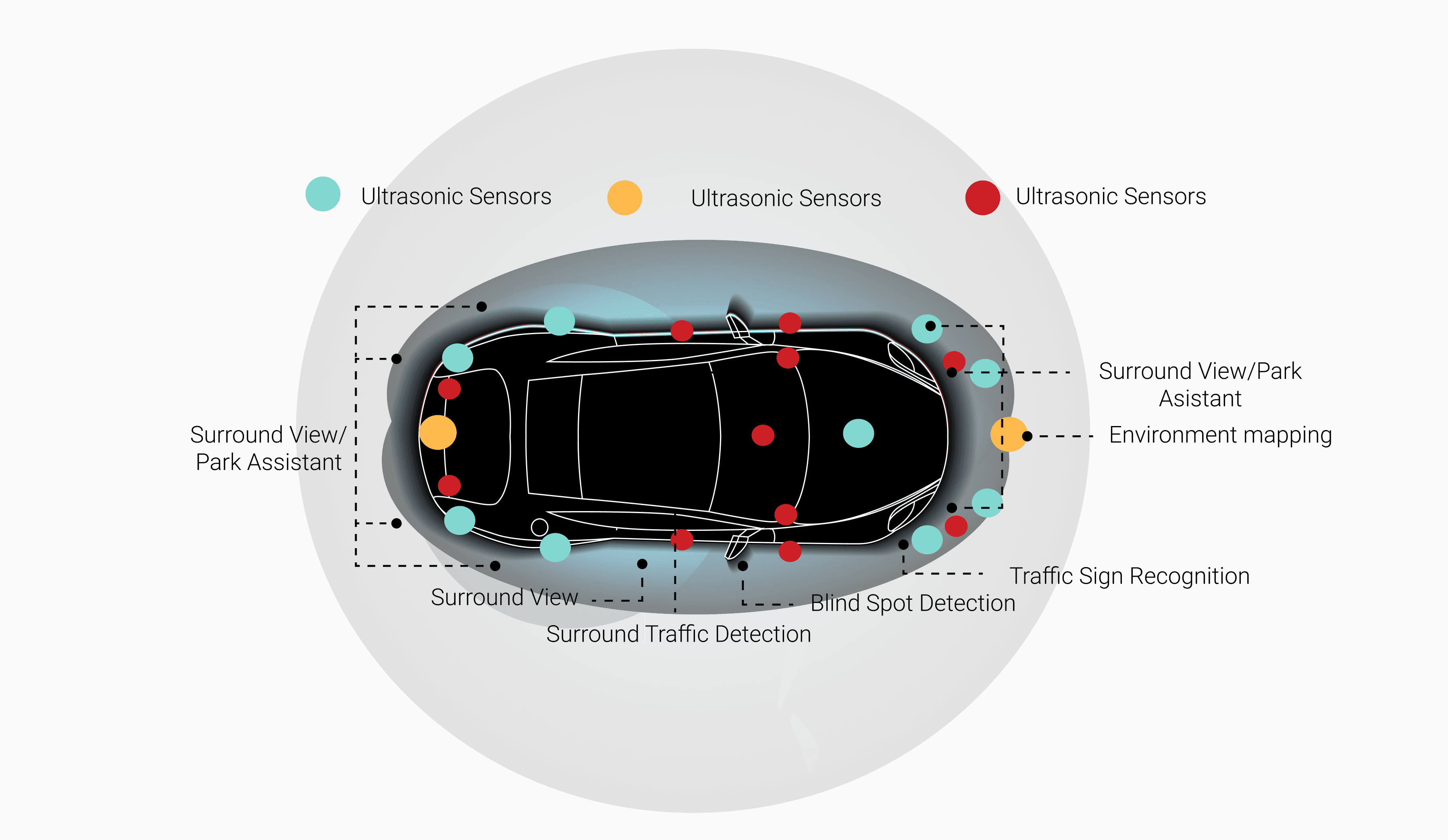
Final sensor placement and function map — camera + sensor locations
Three hierarchies,
one coherent system
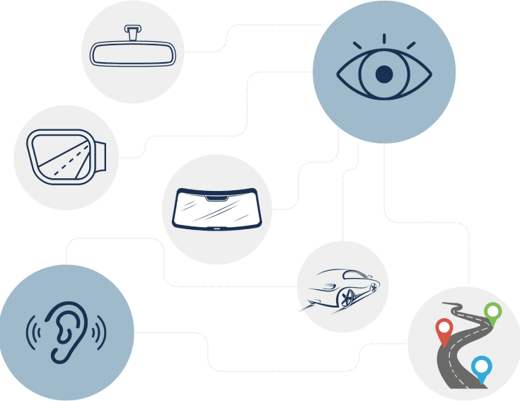
The complexity of a full car MR system was organized into three design hierarchies — each addressing a different dimension of human-vehicle-environment interaction.
AR navigation, real-time road alerts, enhanced visibility in adverse weather, AI-driven predictive collision warnings, and adaptive display intensity based on external light.
Contextual traffic alerts, visual warnings for nearby vehicles, lane departure monitoring, blind spot AR overlays for better rear and side visibility.
Front pillar interactive screen for proximity warnings, driver HUD for gesture/voice commands, passenger side screen for entertainment and contextual information.
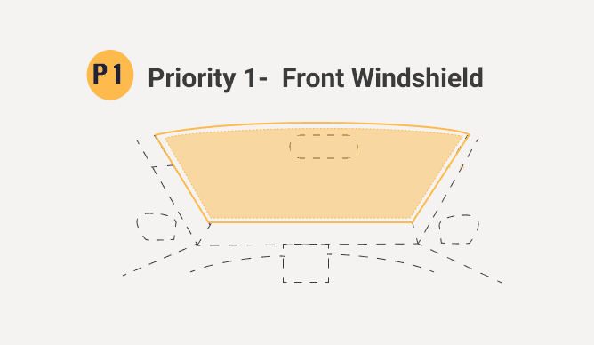
Hierarchy 1 — Driver safety
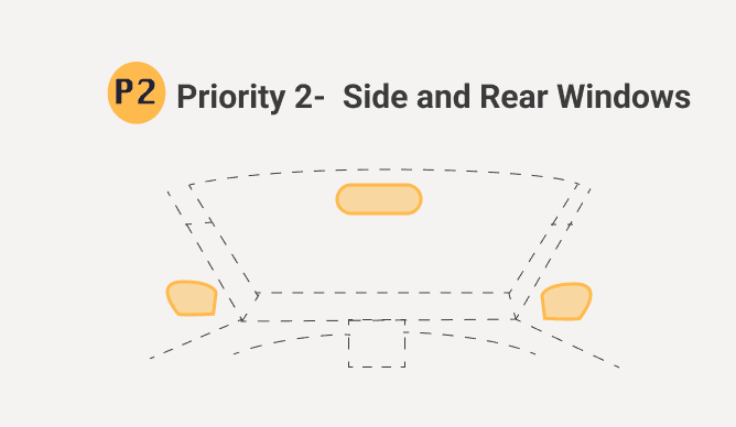
Hierarchy 2 — Perimeter awareness
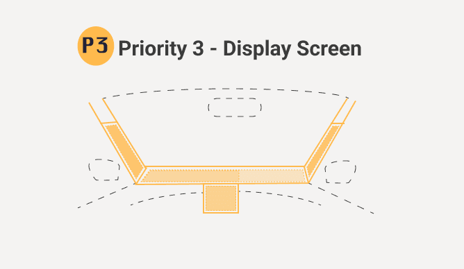
Hierarchy 3 — Surface displays
Major user flow — aligned with natural driver interactions
Initial wireframes mapped the general settings layout, navigation mode, and passenger display across all three surface hierarchies — establishing the information architecture before moving to visual design.
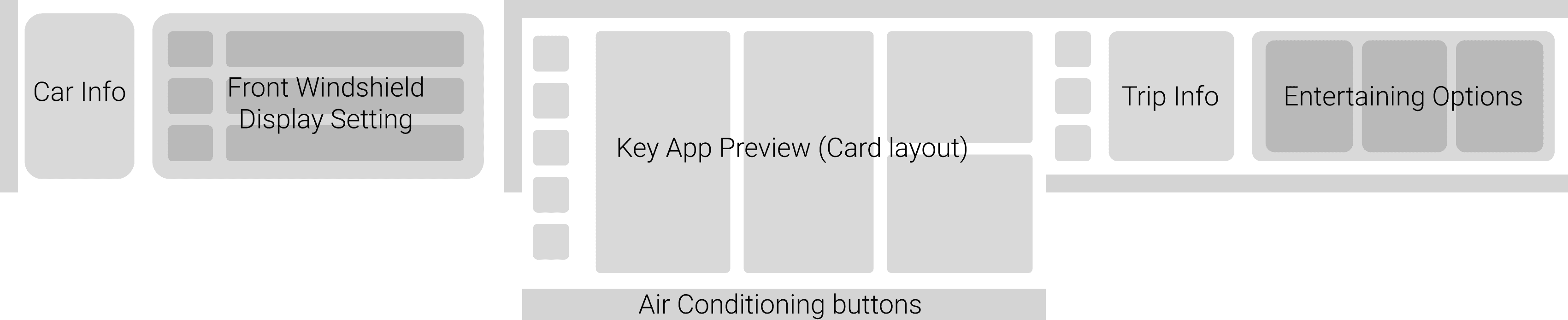
Lo-fi wireframe strip — general settings, driving navigation, and passenger display
Lo-fi detail — driving navigation with real-time traffic and route selection
High-fidelity prototypes were developed for the core driver interactions — each screen shows the windshield AR overlay, the main HMI console, and the passenger surface together as one coherent system. Four scenarios were fully designed and prototyped.
On startup the windshield activates with a minimal overlay — eye protection prompt, speed readout, gesture cue. The system auto-adjusts display intensity before the driver pulls out.
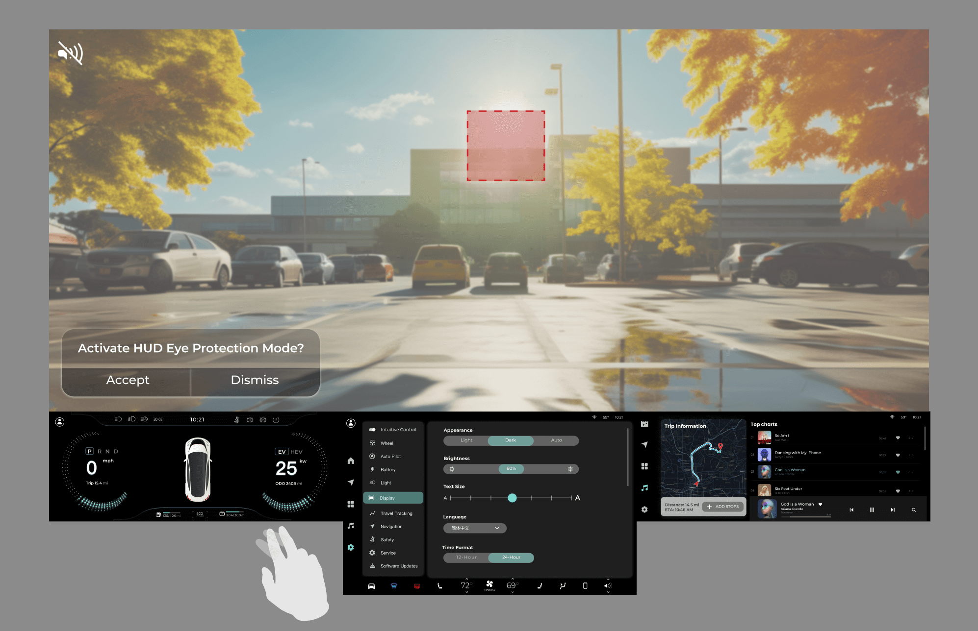
- Minimalist speed / temp display
- Gesture control prompt
- Audio / climate sliders
- Intuitive central controls
- Settings & system
- Navigation and media
- Independent passenger interaction
1.2.0 Drive Auto Initiation Interface
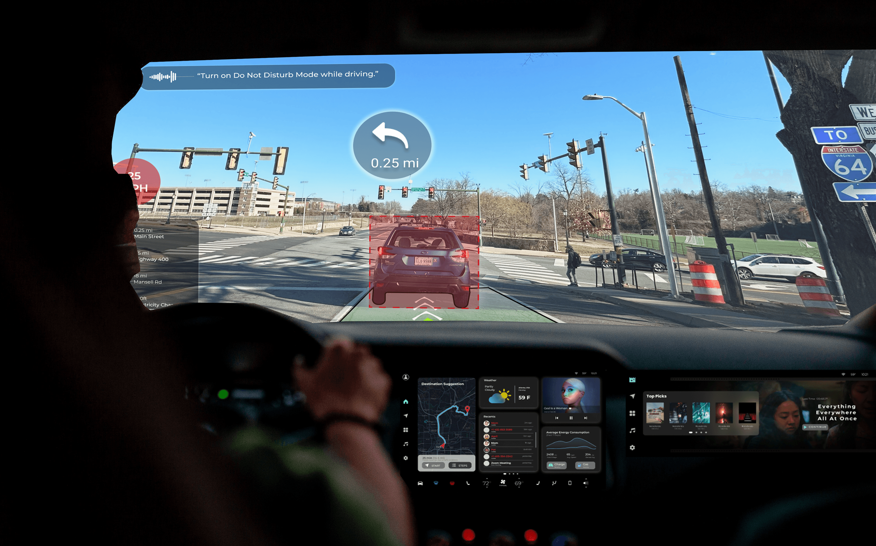
Active city driving — AR navigation on the windshield, real-time hazard alerts with color-coded warnings. The system surfaces only what matters, everything else stays hidden.
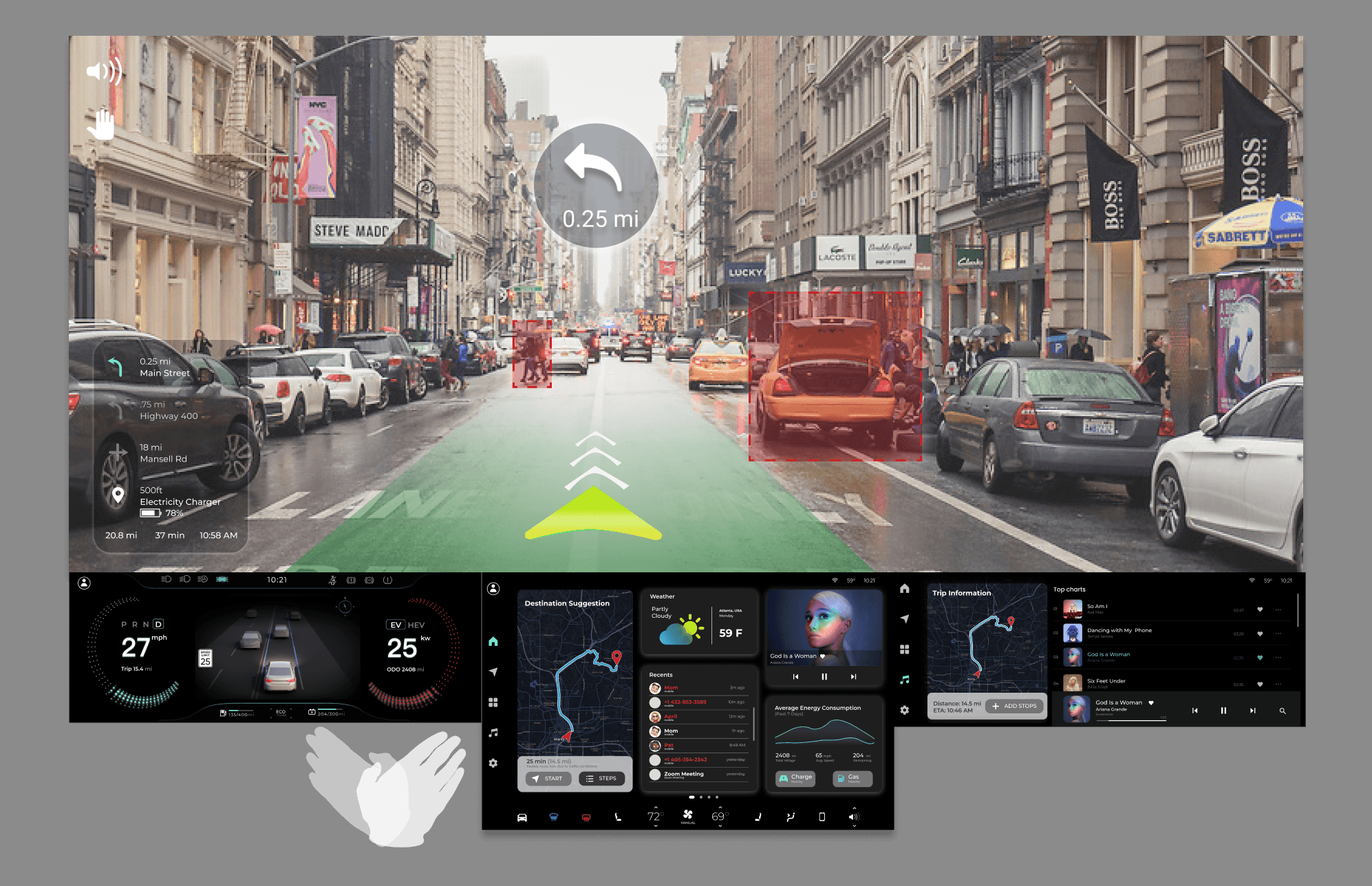
- Turn-by-turn navigation
- Real-time vehicle stats
- Color-change for alerts
- Climate / audio tactile controls
- System status indicators
- Entertainment options
- Interactive connectivity
1.2.3 AI Alert System — AR navigation with hazard detection
Hands-free command layer — voice activation triggers calls, navigation changes, and media without the driver looking away. Right-hand gestures handle the most common commands.
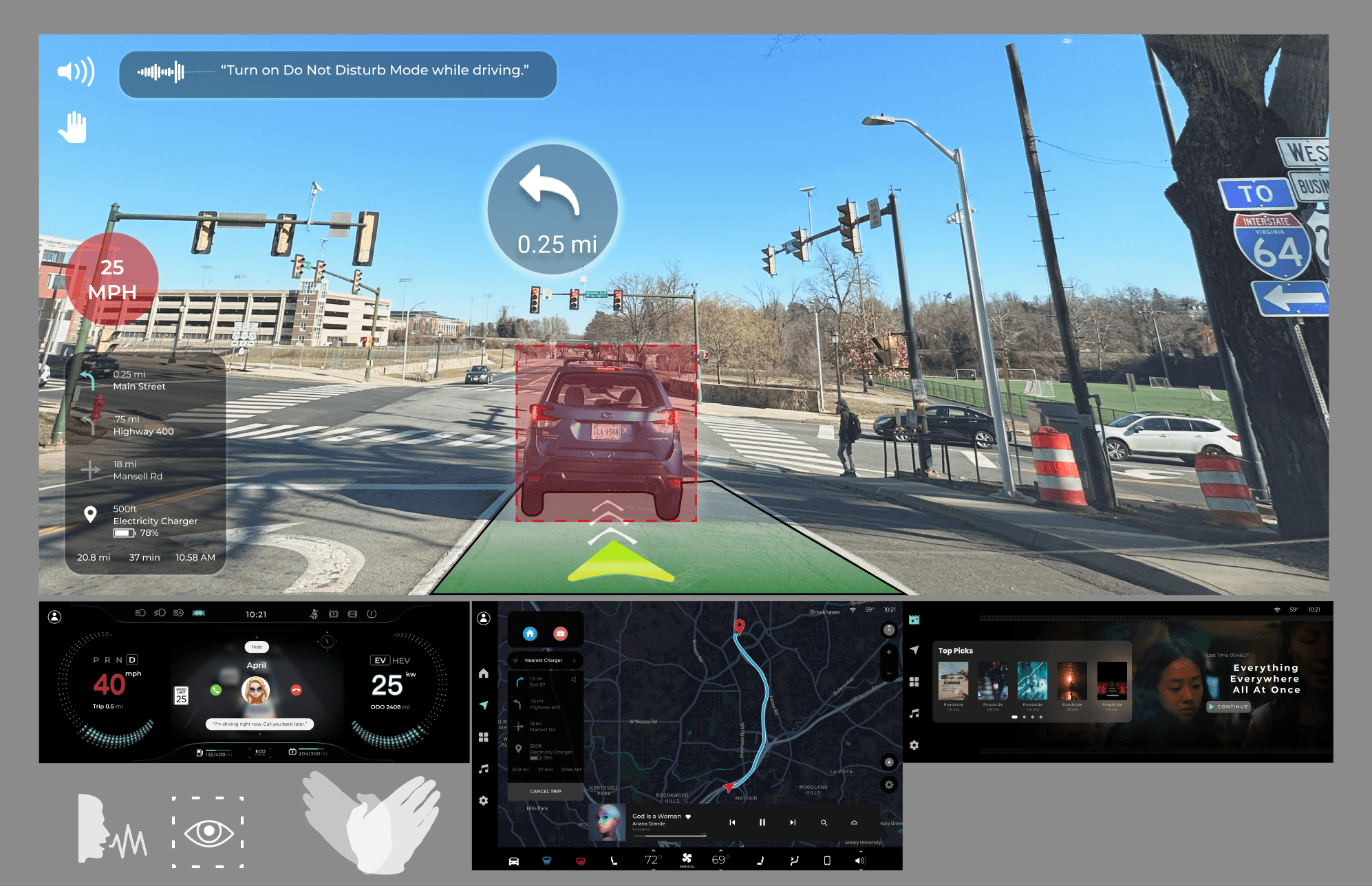
- Speed and navigation HUD
- Voice command activation
- Phone call display
- Intuitive touch controls
- Trip information display
- Media and climate management
- Diverse entertainment options
1.2.3.3 Intuitive gesture and voice control — hands-free command layer
This project taught me that designing for safety is fundamentally about restraint. Every feature I added had to justify why it deserved the driver's attention — and most didn't make the cut. The discipline of removing information turned out to be harder than designing the display itself.
Working alone across the full product lifecycle — from user research to sensor specification to gesture design to prototype — gave me a deep understanding of how each layer of a system constrains and enables the ones above it. You can't design the interface without understanding the hardware. You can't design the hardware without understanding the human.